Why I'm Rebranding my Venture Studio (HAMY LABS Terminal Garden)
Essay - Published: 2025.07.28 | 2 min read (689 words)
create | hamy-labs | share
DISCLOSURE: If you buy through affiliate links, I may earn a small commission. (disclosures)
I'm in the process of rebranding HAMY LABS - my solo venture studio.
In this post I wanted to share a little bit about the rebrand and why I decided to do it.
What is changing in the rebrand?
The rebrand is focused on the brand colors and associated visual assets across my sites, images, and YouTube videos.
The general activities of HAMY LABS will remain the same:
- Building projects
- Shipping tiny businesses
- Sharing my learnings
But the color scheme and perhaps my approach to these activities will shift.
Why rebrand HAMY LABS?
I've now been running HAMY LABS in some capacity for over a decade. For the past 5 years it's settled on a black, white, and red visual identity. The reds have fluctuated over the years but the scheme itself remained consistent.
This worked well for me. It was a unique color scheme and meshed with my creative technology experiments (see hamy.art) which often featured these colors for bold, minimal aesthetics.
But things have changed since I originally chose those colors. I've gotten older and my outlook on life has shifted, my vision has grown worse, and my interests have shifted away from bold visuals and more towards useful systems.
I started to feel that my original color choices weren't really supporting the brand anymore and were getting in the way of how I wanted to do things.
What's the new brand?
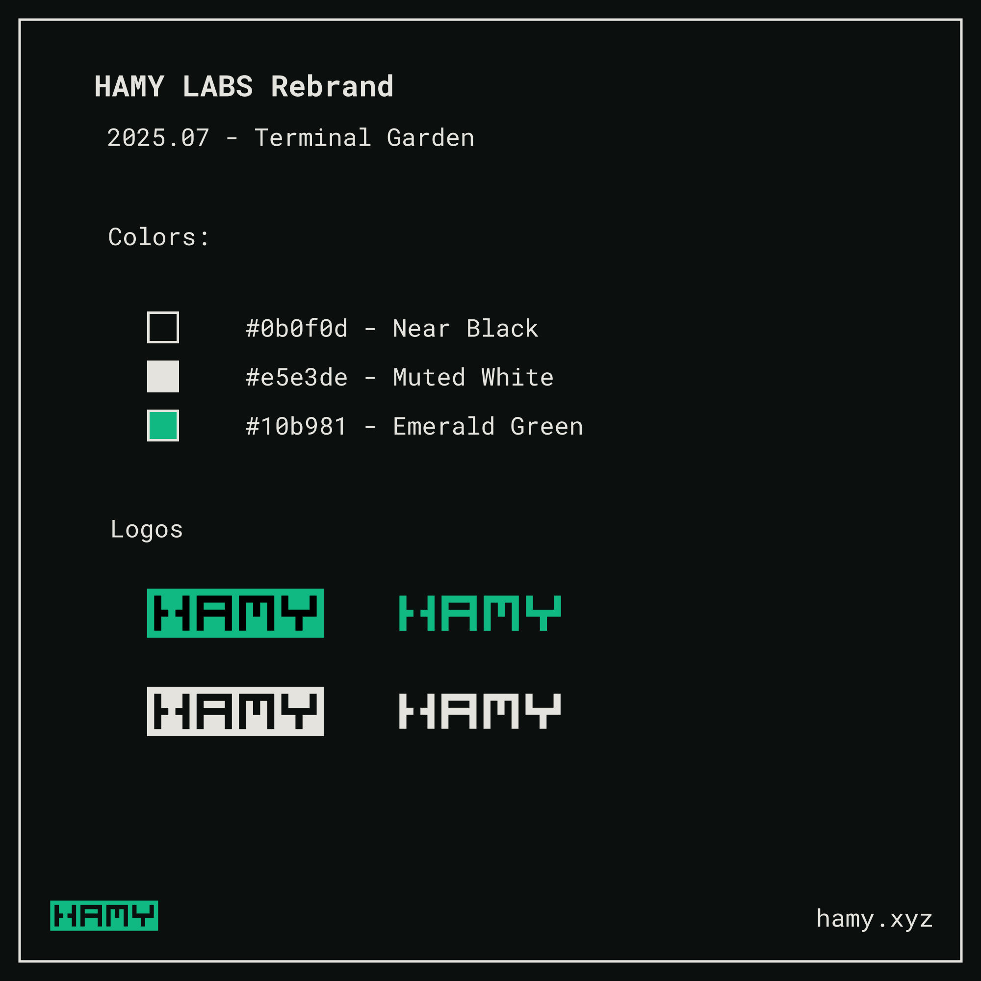
I'm calling the new color scheme Terminal Garden.
- Black: #0b0f0d - Near Black
- White: #e5e3de - Muted White
- Green: #10b981 - Emerald Green
The new color scheme provides a better balance for things I value:
- Represents my interests - A terminal-like green to represent software and plant-like for my focus on sustainable systems (see Simple Scalable Systems)
- Aligns with my strategy - I take on a lot of small projects, less like an architect and more like a gardener. Each project is a seed and I see where it goes so the brand being green aligns well with that. CloudSeed is a good example of a project that already fits with this theme.
- Less aggressive - Red is an aggressive color but I am not a very aggressive person. Green seems much more natural, calm, and growth-focused which I think is a better representation of what I stand for.
- Easier to read - I stare at a computer 12+ hours a day. My vision is getting worse. High contrast colors strain my eyes. So I've opted for colors that have less harsh contrast while still passing contrast accessibility standards and allowing me access to my favorite color - black. This should make it more accessible for people to view (I received several requests for this) and also easier on my eyes to read.
- Better callouts - This shade of green pops more from the background which makes it more suitable for callouts and visual elements than my previous red.
Plus my last name is Greene so I can call this color hamygreen - elohel.
Next
LMK if you have feedback on the color scheme. I probably won't change it much but if there are slightly better variations on the theme, I'm open to suggestions.
I used Claude extensively to help pick out a color scheme - brainstorming colors that fit the brand, coming up with palettes that worked well together and passed accessibility standards, and building mockups to compare and contrast all the different options. LMK if you're interested in how I did this and I'll write something up.
Rebranded visual assets will start rolling out as I get to them. In the meantime you'll probably see a mix of new and old.
If you liked this post you might also like:
Want more like this?
The best way to support my work is to like / comment / share this post on your favorite socials.
Outbound Links
- Simple Scalable Systems - How to find 80/20 Silver Bullet Solutions for any domain
- My Career in Programming Languages
- How to find a fulfilling career - no matter what you're into
- Stop Vibe Coding, Start Power Coding - How To Write Quality Software Faster With Agentic AI (Without Pissing Off Your Software Engineers)