CASE STUDY: Redesigning my sites to focus on building
Essay - Published: 2020.03.08 | 1 min read (282 words)
cases | design | iamhamy | web
DISCLOSURE: If you buy through affiliate links, I may earn a small commission. (disclosures)
This weekend I redesigned my sites to focus on building.
Why building? Over the past few weeks I've been thinking about what it is I want to be doing. What I came up with was something along the lines of leveraging technology to build creative outputs. To that end, I decided to set up a collaboration funnel to get more ideas and perspectives with which to build upon.
As part of this effort, I focused on narrowing available options to those that made the most sense given the context and that were most valuable to me, tightening styles to be closer to that of my overall design system, narrowing the domain of existing sites and spinning off new ones when necessary.
Some examples:
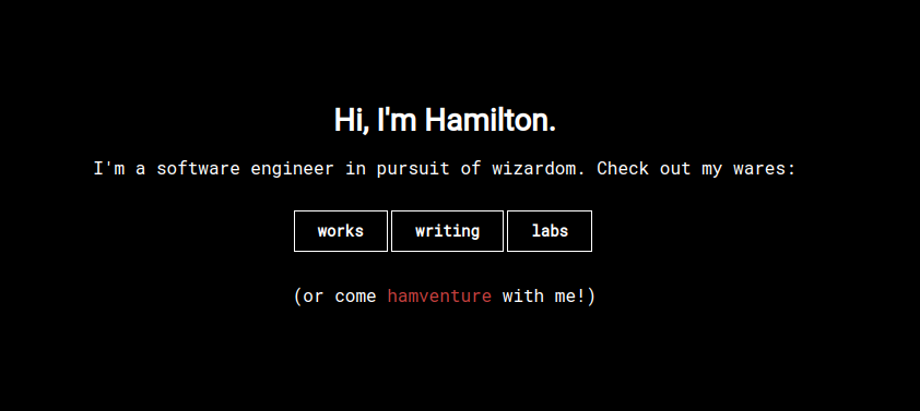
New, focused front page
Rebuilt my home page to limit options to those pages I want visitors to see most
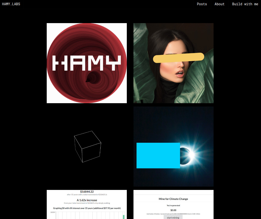
The new HAMY.LABS site
Updated my common styles to fit more closely with my brand design system and values - impact and pragmatism
Simplified button menus on each site to focus on just what's important in each context
Gave the menu bar a better indicator of the current "context"
Updated my front page gallery styles to cut down on busy-ness and focus on individual elements
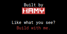
New building call to action
seeded the bottom of every page with a call-to-action -> to build with me
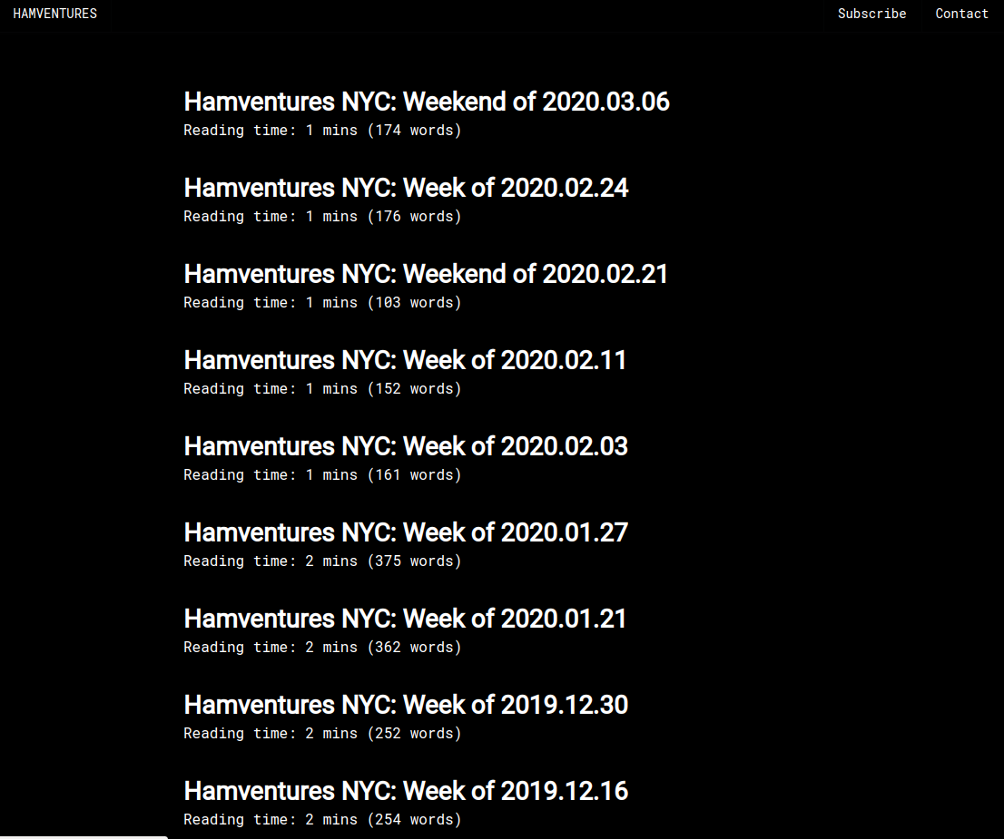
New hamventures standalone site
Spun out hamventures into its own standalone site
see old styles
To see examples of the old styles, read my Hugo theme's original launch post.
Want more like this?
The best way to support my work is to like / comment / share this post on your favorite socials.


