Introducing hamship - a new Hugo theme for HAMY properties
Essay - Published: 2019.11.20 | 3 min read (856 words)
hamship | hugo | theme
DISCLOSURE: If you buy through affiliate links, I may earn a small commission. (disclosures)
This month I've been focusing on improving my existing projects and the latest improvement due to that has been moving all my sites to a new theme. In this post, I'll talk about why I thought it was time to get a new theme and how I solved it in the new theme I created, dubbed hamship.
problems with my existing themes
large surface area to maintain
I use Hugo, a static-site generator, to build my sites. This gives me a huge amount of flexibility in modifying my sites to fit my needs as I have direct access to all the code in the stack.
However this flexibility comes at the cost of time and effort to track down and fix the code breaking your site. This cost multiplies as you add in additional sites (of which I currently have 4) and additional themes (at the time, each was on its own theme) as the lines of code you have to parse and use cases you have to keep in mind grow with them.
sites weren't focused on my most important content
I get a fair amount of views to my online properties (around 1,500 monthly at last count) but I realized that most of those views weren't useful or valuable. They come to my site, get their content, and leave. A few will click around, but they never seemed to get to the content I most want viewed - my projects.
This observation, coupled with feedback I'd gotten that people get lost in my sites, led me to believe that most people won't go beyond the first page they land on and those that do will almost always only go one click. Thus it seemed that my important content was all a few layers too deep in my site tree and it'd be a lot of work to refactor each of the different themes I was using to showcase the most important content for each site.
sites didn't feel 'me'
A more subjective problem I had with my sites is that there wasn't really a cohesive visual theme to tie them all together. They of course all lived under the same domains but some light research in my friend groups revealed that people didn't really find them connected.
Plus I've developed a visual theme over the years that I've really come to like and it seemed like a wasted opportunity to not display it front and center on my sites.
the solution (I chose)
Obvs there are an infinite number of ways I could've gone about solving this problem for myself but I basically boiled it down to a few constraints that worked for me and fit my interests.
- Use Hugo - I love that it's open source, I love the idea of JAM stack, it's easy, and it works
- Have one theme to rule them all - As much as I love building things, I don't love tracking down endless bugs. Having one theme would allow me to fix once, profit everywhere and that holds for developing as well #systematicimprovement
- Make it easy (and configurable!) to focus on certain content - each of my sites focuses on something slightly different so this one theme had to work for each
- Make it me
hamship
Thus hamship - rooted on the word flagship cause it was gonna be all over my sites and with a ham plopped on cause HAMY.
Some current features and how I use them to make the theme work for me:
configuration
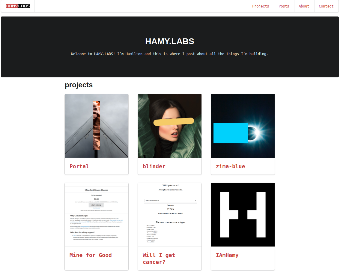
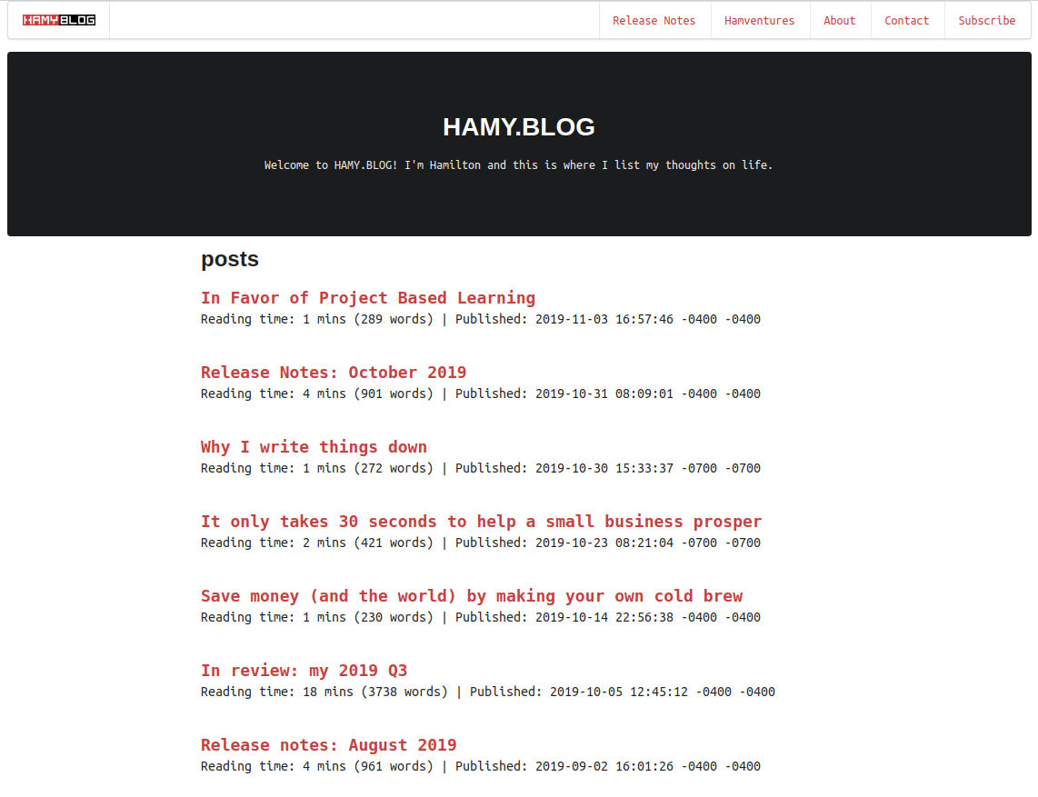
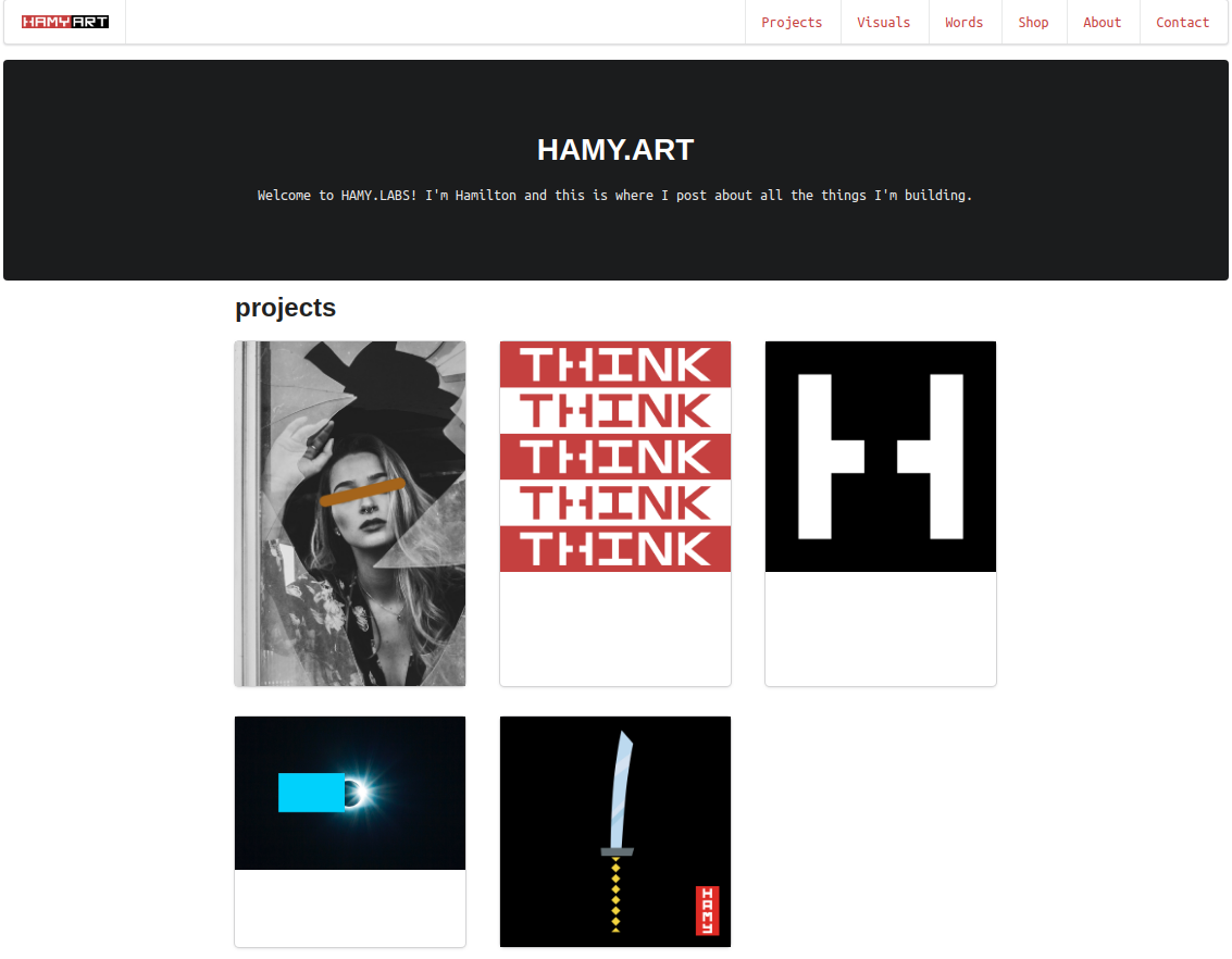
You can configure how each type of content is displayed as well as feature different content types on your homepage. I feature my projects on Labs, posts on my blog, and Art features my art, sans titles.
HAMY.LABS:
HAMY.BLOG:
HAMY.ART:
You can also configure the logos and menu items as you see fit. I created new logos for my blog, Labs, and Art as well as featured my projects in Labs and Art and posts for my blog.
HAMY.LABS:

HAMY.BLOG:

HAMY.ART:

I've baked in elements of my own design system in this theme, like the fonts, color, and style options but it could be genericized with relative ease.
Other configurations:
- code highlighting via Google's Prettify
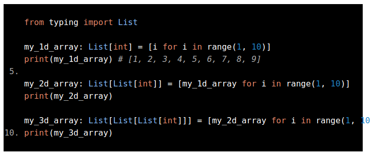
You can read the original post here
- customizable footers in
singletemplates - I use them for ads and for site-wide calls-to-action
- A reading time and word count widget at the top of every
single

performance
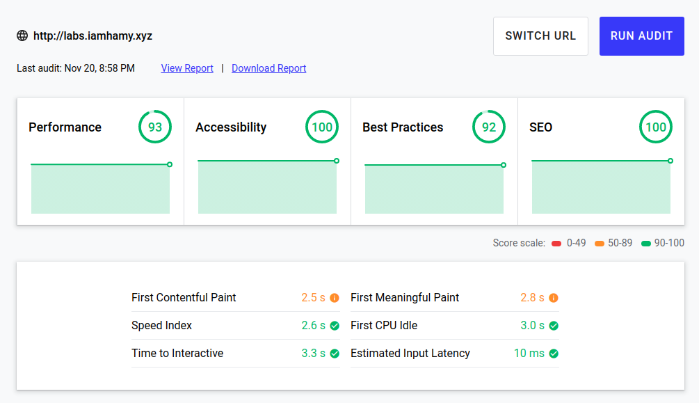
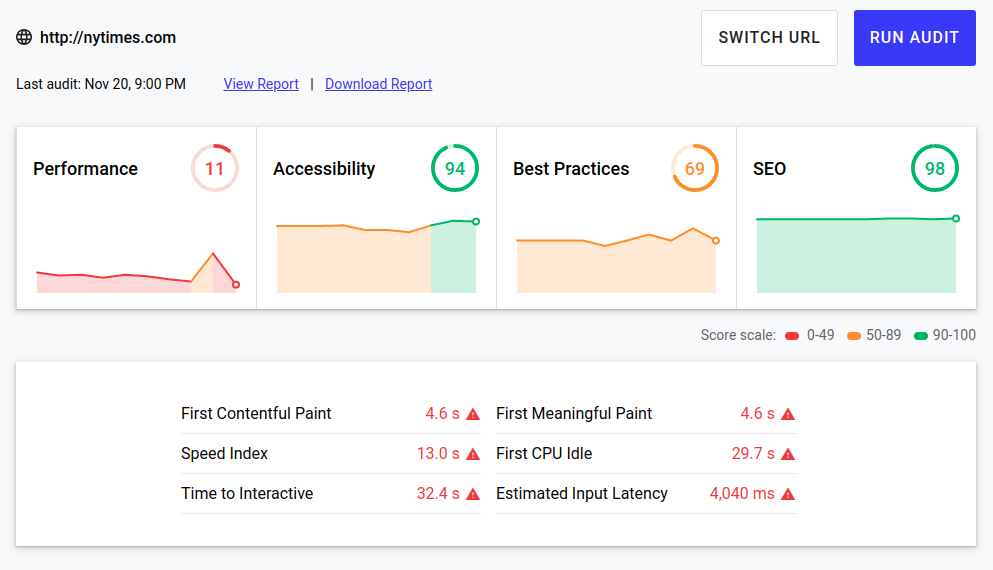
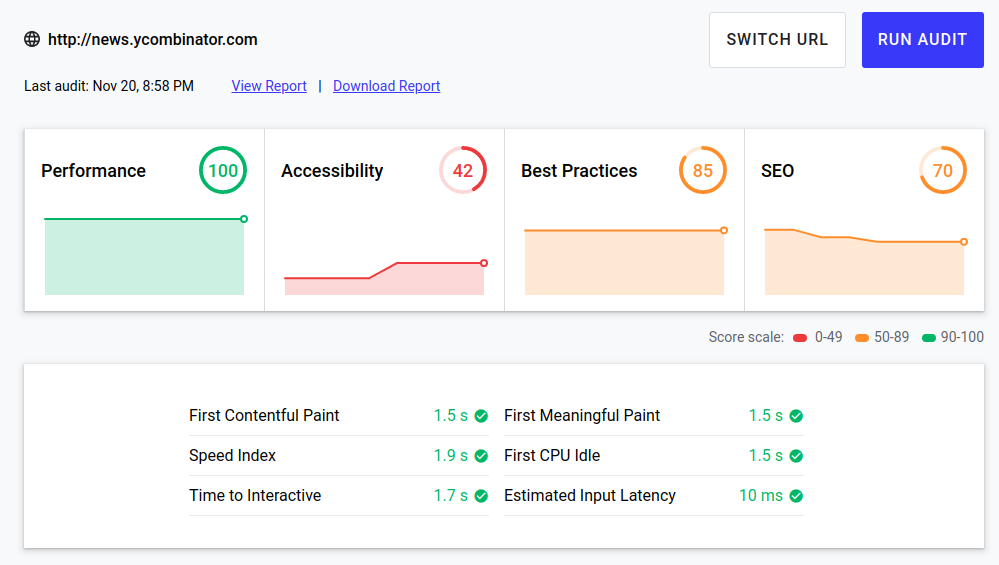
Plus I beat out The New York Times and Hacker News in 3/4 categories on web.dev!
fin + future work
I'm considering posting the theme on Hugo's theme marketplace but I think I need to sort out the coupling of my styles in the theme first. Until then poke around my sites (they're all linked here) and let me know what you think via my contact page!
Always building,
-HAMY.OUT
Want more like this?
The best way to support my work is to like / comment / share this post on your favorite socials.

