iamhamy 3.0
Essay - Published: 2020.10.21 | 3 min read (896 words)
iamhamy | projects
DISCLOSURE: If you buy through affiliate links, I may earn a small commission. (disclosures)
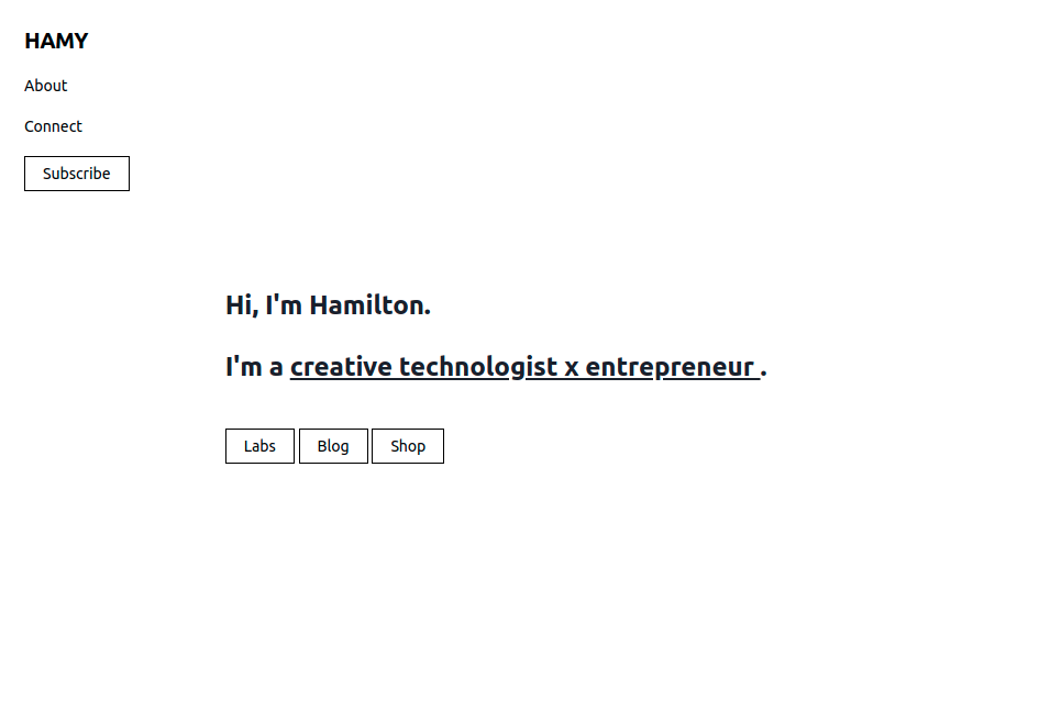
iamhamy 3.0 - Front page
Overview
iamhamy 3.0 is my latest iteration on my sites making them more efficient, more sustainable, and more accessible than ever before. Through this project I hope to provide a better platform to share my efforts in creative technology x entrepreneurship.
Context
Earlier this year I performed another site redesign with a similar goal of focusing on my projects and the brand I wanted to create. It was successful in doing this by narrowing the navigation choices available to visitors to just those I wanted to feature, bringing the visuals of my projects to the fore, and using a unique, cohesive visual design to bring it all together.
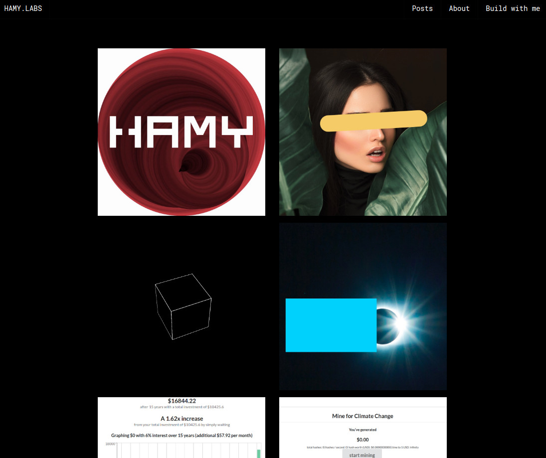 iamhamy 2.0
However there were also issues with the old design.
- Accessibility - This focus on making the design unique hurt accessibility - according to webaim.org, my link colors (red on black) failed the WCAG AA and WCAG AAA accessibility standards. In 2020, there's no excuse for building websites without a base level of accessibility.
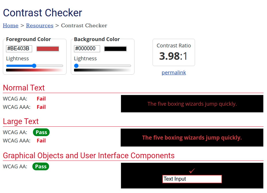
iamhamy 2.0 accessibility - webaim.org
- Aesthetics - The design was cool and v digital. This worked well for my image heavy content but I felt that it was suboptimal for text heavy content. My Release Notes are a big part of my brand and identity and regularly go over 5,000 words so I felt I could do better.
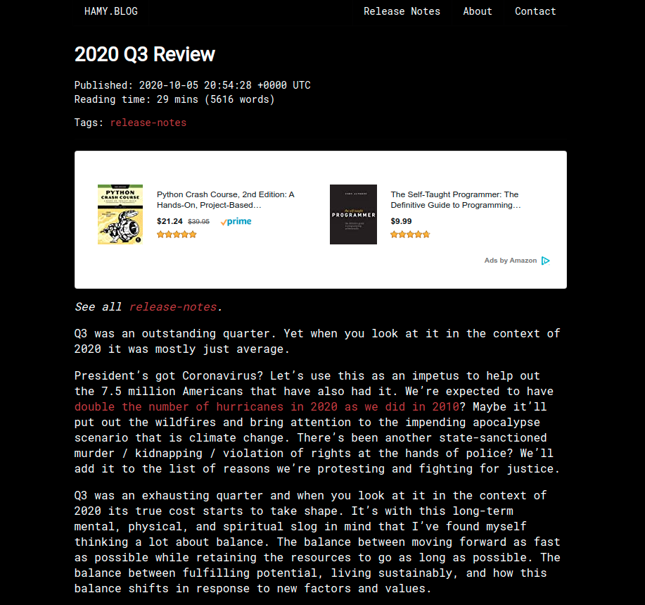
iamhamy 2.0 text sample - 2020 Q3 Review
- Efficiency - Ever since iamhamy 1.0, I've been using Semantic UI to style my sites. I've long enjoyed UI frameworks because they provide ready-made, well-designed components that you can use right out of the box. Lately though I've been wondering if the trade off is worthwhile. I've found that while there are definitely beautiful, well-designed components in these frameworks I often end up fighting with them to get them to look and work the way I want them to, negating most and maybe all of the efficiencies of using them in the first place. Moreover, many of these frameworks are just plain large - Semantic UI came out to ~100 kb - even though I was only using it to style a few pages of HTML. I felt that it might be time to go back to basics to create a more sustainable, efficient platform.
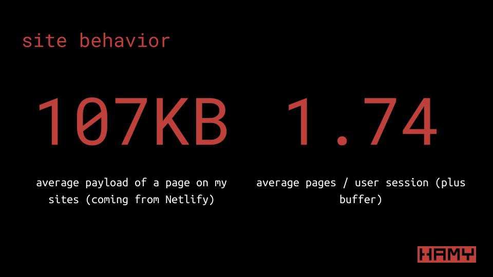
iamhamy 2.0 efficiency - as calculated in How I scale my sites to 500k users per month for free
So I sat down to Build Back Better.
I originally started with Material - Google's web design component library - but soon ran into the same issues of fighting with components and large payload sizes that I had in my previous site iteration. So I switched it up and went with Tailwind CSS which got me back to basics, building in pseudo css and allowing me to keep just the css that was needed. I pulled in a Tailwind plugin for typography for a little extra confidence in the aesthetics and accessibility department and went to work.
- Accessibility - All text on the new site is black (#000000) and the background is all white (#ffffff), leaving me with high accessibililty marks across the board. I didn't completely get rid of the red, but it's now relegated to hover effects and highlights.
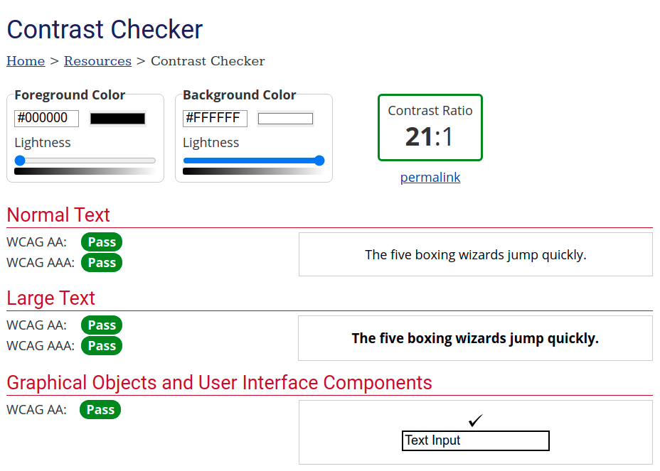
iamhamy 3.0 accessibility - webaim.org
- Aesthetics - I've still got a little work to do on my image heavy content like my projects page but I think the the text is far cleaner and easier to read than it was before.
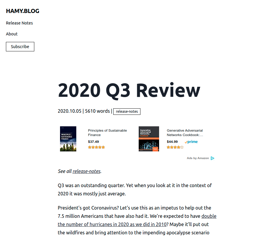
iamhamy 3.0 text page - 2020 Q3 Review
- Efficiency - So far Tailwind has been a breeze to work with. It just works and it looks like it'll have some maintainer steam for years to come. I've also been able to bring my css payload down to 7.6kb (41.2 kb without compression) which is about 15x less than the 107kb of Semantic UI. Needless to say, this means my pages will load in a flash on almost any network, is unlikely to take a toll on anyone's data plan (also a key part of accessibility), and likely means that I'm now able to serve 7.5 million visitors / month on the Netlify free tier based on my previous site capacity calculations (though I'll need to do a full analysis later on).
Of course no iamhamy iteration would be complete without taking a quick look at web.dev.
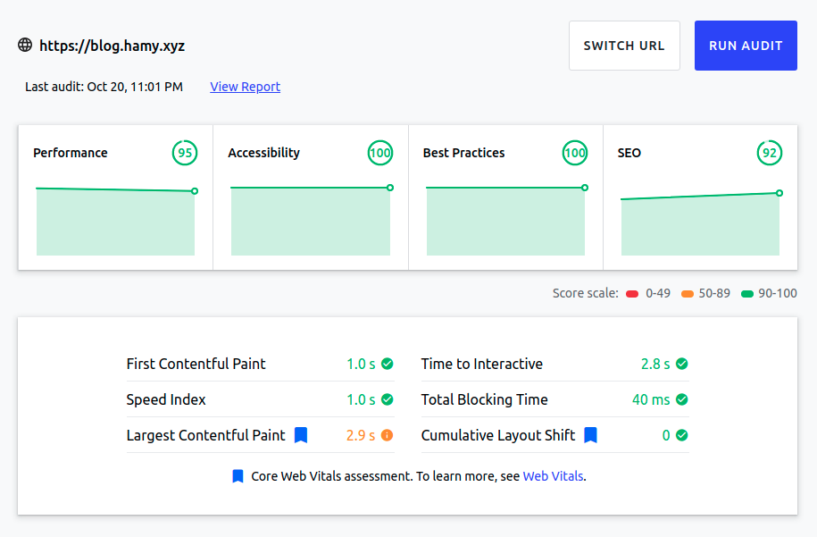
iamhamy 3.0 web.dev run
This is a run on the main page of my blog. Let's compare that to another famous list page - Hacker News:
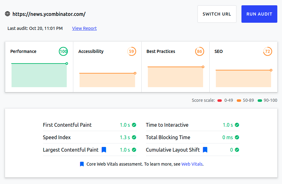
Hacker News web.dev run
So I'd say iamhamy 3.0 hit its marks pretty well. But there's always room to improve. If you have any feedback on what I can do better, drop me a line. My sites will thank you.
How it was built
iamhamy 3.0 was built with:
- Hugo - A fast, light static site generator
- Tailwind CSS - A fast, light, and highly extensible atomic CSS library
- Netlify - An easy, fast, and free static site hosting service
Where to find it
Take a breather, you're already here.
Want more like this?
The best way to support my work is to like / comment / share this post on your favorite socials.
